So, I was going to spend today finishing off an fmp brief - but as always I've been side tracked.
I started talking to a friend of mine again about coding my website, and he's got some free time on his hands so I figured why not just go for it today!
I never really wanted a really posh portfolio site - it seems a bit fake for me in a way.. I've always been one for honesty, and I like the idea of having a blog that I'm able to update and open discussions on, as well as having my portfolio available if people are interested. It also allows me to not only post the finished pieces of my work, but the construction and development process.. This whole idea fits my way of working so much better - and it also means that once the template is up and running it's incredibly easy to update.. I have a habit of totally forgetting html coding moments after I've finished with it.
Anyway, here's the basic layout in a few variations -
Showing posts with label Personal Identity. Show all posts
Showing posts with label Personal Identity. Show all posts
Saturday, 14 May 2011
Friday, 22 April 2011
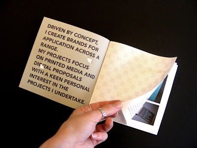
Portfolio / 'leave behind' Booklet Finished
Really happy with this booklet so far - it will continue to develop and change as I do, but for now it does the job nicely!
The selection of work I have included differs from that of my mini PDF portfolio - which most agencies will have seen when I initially email them anyway.. So it's a nice way of getting them to see more of my work without having to flick through my whole portfolio. Also, I plan to vary the content of the booklet depending on the studio I've contacted - I have quite a varied portfolio after 3 years of studying, and not all of it is relevant to everyone I contact!
The selection of work I have included differs from that of my mini PDF portfolio - which most agencies will have seen when I initially email them anyway.. So it's a nice way of getting them to see more of my work without having to flick through my whole portfolio. Also, I plan to vary the content of the booklet depending on the studio I've contacted - I have quite a varied portfolio after 3 years of studying, and not all of it is relevant to everyone I contact!
Wednesday, 20 April 2011
Portfolio / 'leave behind' Booklet Development
Miniature mock ups of the leave behind booklet -
The cover is a light grey card, with a really light weight stock for the pages, all branded to tie in with my stationery - square format to echo my choice of logo.
The cover includes a variation on my position statement, and the most important bits from my C.V, my education, experience and skills.
I actually really like the miniature version.. really cute! but a there's quite a lot of information going in it - so I think a larger format would be more appropriate.
Wednesday, 13 April 2011
Portfolio / 'leave behind' Booklet
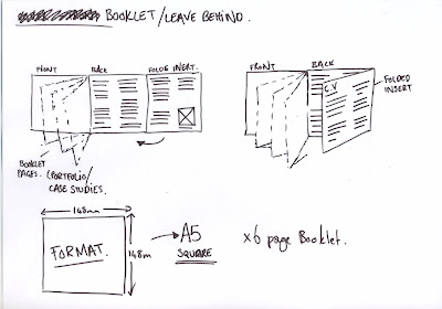
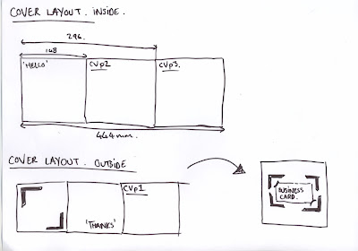
Going down to Teabag Studio on Friday to do some stuff for the context book, ask a few questions and the like - but it would be a missed opportunity not to leave them something to remember me by - so I've come up with a plan for a booklet/cv/business card general purpose solution to all those scenarios where I don't want to bring my full portfolio - but I want to make an impression.
Here's the plan - It'll be printed tomorrow
Here's the plan - It'll be printed tomorrow
Monday, 14 March 2011
New Business Cards
Ahead of the Creative Milk Round event on Wednesday, I've decided to update my identity and business cards. There's currently two logo elements that i'm working with - the big block square shape was that was derived from my initials, and then the framing device that I could use as an alternative.
I've decided to just use the framing device for now - as it was my intention the the two logos would never really be seen together. I think it takes some confidence to just abandon the standard logo conventions - so that's exactly what I'm going to do.
BACKS:
Going with the bottom left variation.
FRONTS:
Going with the top right variation.
Getting these printed tonight - and I plan to foil block the front with black foil.
Monday, 7 March 2011
Personal Identity - Update
Some slightly altered versions of my logo, I think the one on the far right is the one I will go with.
I want my brand to be composed of several different elements that can be used in conjunction with each other or separately - One thing I desperately want to avoid is the standard logo applied to a business card/letterhead senario, I think as a designer this displays a distinct lack of imagination.
I did like the idea of using an arrow in my branding, but as time went on it started to feel unoriginal (because it is) and a bit of a cop out (because it is). So I've opted for the reverse out right angle, which can in turn be used on it's own... like so:
I decided to stay with Avenir as my typeface of choice. I used it a lot last year... it comes in quite a few different weights, and it just fits so well with the rest of my branding.
Website Layout
PPD has suffered some neglect for the past month or so. Going to recfiy this this week, starting with my website. Just had a quick look at my options, and I really love this layout by Design Project.
It's a little bit difficult to be original when your options for a website are as limited as mine. All my knowledge of web building has been forgotten over the months, but I'll try my hand at building from scratch before I resort to Indexhibit I think.
It's a little bit difficult to be original when your options for a website are as limited as mine. All my knowledge of web building has been forgotten over the months, but I'll try my hand at building from scratch before I resort to Indexhibit I think.
Friday, 21 January 2011
New portfolio & Steve Wills sign up
I've spent the last few days trying to re-brand myself and layout my portfolio at the same time in preparation for this sign up with Steve Will of B&W Studio. I actually got pretty nervous about it at some points - but he was really down to earth and very complimentary about my work. I think even if nothing comes of this, it was so nice to have someone you've admired for a while to be so positive about your work, a good confidence boost if nothing else!
I think I'm going to make some changes to my work and follow up this meeting with an update of how I'm getting on. I was really encouraged to hear him talk about some of the things I've outlined in my new position statement as well - he was talking about a range of different, interesting applications for brands that I'm coming up with. Which is exactly what I want to do in the next few months!
Perhaps the most surprising thing was that he thought my 2nd year 'Rant' project was the best, the most interesting and the one with the strongest concept. The most annoying thing is, on reflection he's probably right...
Monday, 27 September 2010
Business Cards - Text Layout
Really like the little arrows, both as an interesting accent to the text, but mainly because it reflects the arrow shape in my logo.
The outline is just so you can see the document borders, this isn't a part of the design.
 |
| The favourite so far. |
Sunday, 26 September 2010
Business Cards
What a revelation, I do already have a business card, just not one I'd be happy showing to any industry professional. Remarkably similar to Will's you might say, well yes, it was the process I was most interested in and he happily lent me his text layout just to test this.
I did about 10 variations of the design on the front, but they were all pretty poor - quite like this one though.
As far as the process goes.. quite easy to hand produce, but as you can see from the product shot they are going a bit curled at the edges. Going to try something similar for Wednesday with thicker stock - and my own text for the back.
Thursday, 16 September 2010
Subscribe to:
Posts (Atom)


