Wednesday, 20 April 2011

Portfolio / 'leave behind' Booklet Development

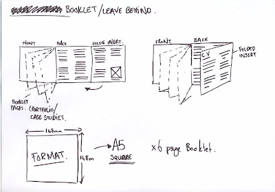
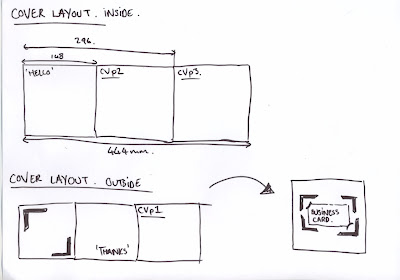
Miniature mock ups of the leave behind booklet - 
 
The cover is a light grey card, with a really light weight stock for the pages, all branded to tie in with my stationery - square format to echo my choice of logo.

The cover includes a variation on my position statement, and the most important bits from my C.V, my education, experience and skills.

I actually really like the miniature version.. really cute! but a there's quite a lot of information going in it - so I think a larger format would be more appropriate.


Wednesday, 13 April 2011

Portfolio / 'leave behind' Booklet

Going down to Teabag Studio on Friday to do some stuff for the context book, ask a few questions and the like - but it would be a missed opportunity not to leave them something to remember me by - so I've come up with a plan for a booklet/cv/business card general purpose solution to all those scenarios where I don't want to bring my full portfolio - but I want to make an impression.

Here's the plan - It'll be printed tomorrow


Monday, 14 March 2011

New Business Cards

Ahead of the Creative Milk Round event on Wednesday, I've decided to update my identity and business cards. There's currently two logo elements that i'm working with - the big block square shape was that was derived from my initials, and then the framing device that I could use as an alternative.

I've decided to just use the framing device for now - as it was my intention the the two logos would never really be seen together. I think it takes some confidence to just abandon the standard logo conventions - so that's exactly what I'm going to do.

BACKS:
Going with the bottom left variation.


FRONTS:
Going with the top right variation.


Getting these printed tonight - and I plan to foil block the front with black foil.

Tuesday, 8 March 2011

A list of Agencies

So after about 4 hours of endless internet trawling I've decided to keep a running list of some of the agencies in the area - and by the end of this week I'm going to have e-mailed all of them with either my portfolio, a request regarding my context book or simply to say hello.

My plan at the moment involves staying in Leeds after we graduate for at least a year or so before moving on. I know the south beckons, but I'd like to stay here for the time being to find my feet.. Having said that I do plan to look in the surrounding cities - York and Manchester are both easily commutable from here.. Nothing set in stone obviously, and so far I'm keeping my options as open as possible.
Anyway -

The Leeds List

The York List

The Manchester List
  • Music - Context Research

Other

THESE LISTS WILL BE UPDATED OVER TIME.

Monday, 7 March 2011

Personal Identity - Update

Some slightly altered versions of my logo, I think the one on the far right is the one I will go with.


I want my brand to be composed of several different elements that can be used in conjunction with each other or separately - One thing I desperately want to avoid is the standard logo applied to a business card/letterhead senario, I think as a designer this displays a distinct lack of imagination.

I did like the idea of using an arrow in my branding, but as time went on it started to feel unoriginal (because it is) and a bit of a cop out (because it is). So I've opted for the reverse out right angle, which can in turn be used on it's own... like so:


I decided to stay with Avenir as my typeface of choice. I used it a lot last year... it comes in quite a few different weights, and it just fits so well with the rest of my branding.

Website Layout

PPD has suffered some neglect for the past month or so. Going to recfiy this this week, starting with my website. Just had a quick look at my options, and I really love this layout by Design Project.


It's a little bit difficult to be original when your options for a website are as limited as mine. All my knowledge of web building has been forgotten over the months, but I'll try my hand at building from scratch before I resort to Indexhibit I think.

Wednesday, 2 February 2011

Duffield Print Visit

A few of us went to visit Duffield Printers on Kirkstall Road today, courtosy of Hannah Jackson's organsiation... Thanks Hannah!


Plate etching process..


The digital printer - interestingly enough this is a very popular, and cheap alternative to the litho process, and the quality is pretty much identical - well superior to inkjet and laser printing. The guys we spoke to told us that the technology and market for this kind of printing is on the rise, and could well take over tradition lithographic printing.
 Paper Storage...


Two litho printers.. we checked out the big 10 colour one - this one could do both sides at once: 4 colours for CMYK on one side, 4 for CMYK on the other, and then two left over for spot varnishes and special inks.


Paper feeding uses suction pads to shift the paper from the pile..


The print quality is all managed by computer, so the quantity of ink can be managed in minute detail..